Check out my brand new children book illustration website at: www.icreateworlds.net

Visitem o meu novo website sobre ilustração em : www.icreatewords.net
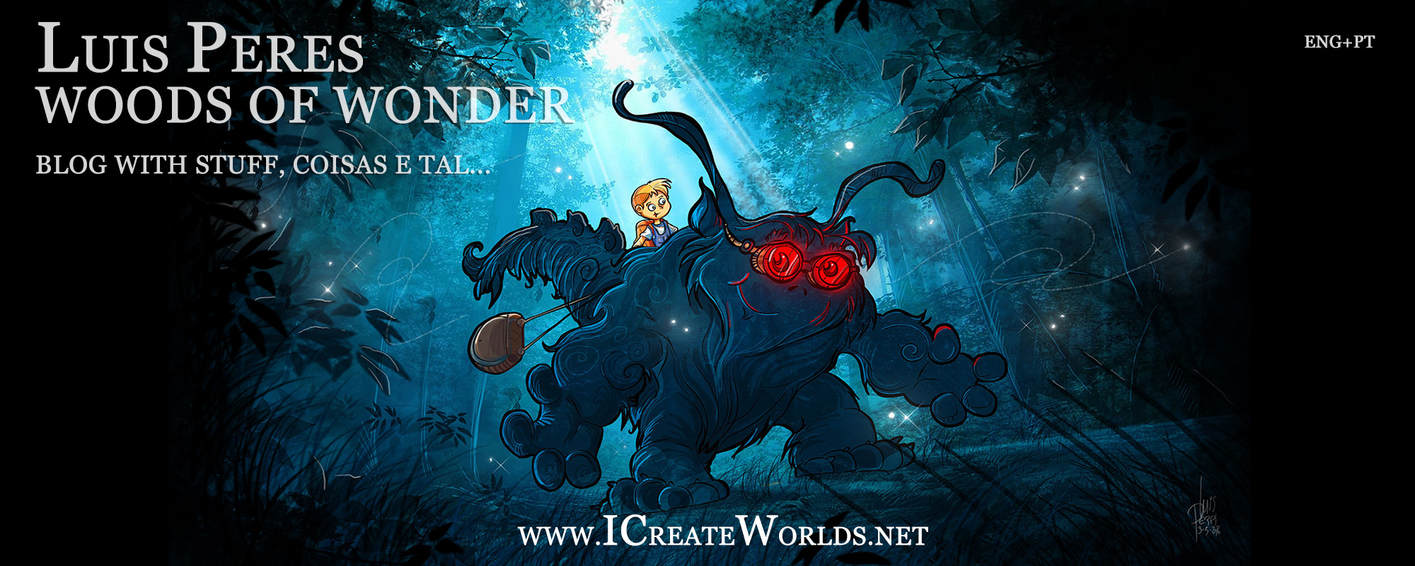
Check out my brand new children book illustration website at: www.icreateworlds.net
Visitem o meu novo website sobre ilustração em : www.icreatewords.net
Sorry english spoken friends. This time this text here will only be in Portuguese because it´s a review for a book, that for now it´s only available in Portuguese as it´s a fantasy novel from Brasil. When it´s released in English later on, i´ll add an english version for this review then. For now, this one is just for Portuguese spoken people. 😉
UPDATE OUTUBRO 2016: Infelizmente J.R.Pereira, o autor deste livro faleceu de doença prolongada um par de meses após eu ter escrito esta review. Bem antes do livro ter uma distribuição em larga escala; por isso certamente hoje se encontrarem uma cópia será talvez em alfarrabistas ou lojas de livros usados, feiras, etc.
De qualquer forma decidi manter aqui a minha review pois o livro é realmente muito original e neste momento tornou-se também num objecto de coleção que recomendo vivamente se o conseguirem encontrar. – Luis Peres 2016
Quando eu pensava que já nada me surpreenderia no que toca a conceitos e histórias de fantasia, eis que me deparo com [“Mil Nomes – O Guardião do Infinito”] do escritor Brasileiro J.R.Pereira e acho que ainda estou a tentar recuperar os pedaços de cérebro da parede. Isto porque ler “Mil Nomes” é uma experiência única. Pelo menos eu nunca tinha lido nada assim.

Nas suas 200 páginas há mais ideias, conceitos, criatividade e imaginação do que em muitos livros de milhares e milhares de páginas.
[“Mil Nomes – O Guardião do Infinito”] é um livro difícil de se ler. Mas não pensem que é por ser chato ou arrastado ou algo assim. Não, “Mil Nomes” é díficil de se ler porque, primeiro apanha o leitor totalmente desprevenido pelo próprio estilo do conceito. Quero dizer, a mim pelo menos nunca me passaria pela cabeça que alguém resolvesse um dia escrever aquilo que é essencialmente um Manga (ao melhor estilo Japonês) mas em prosa !!! What ?!!!
E resulta ?
Se resulta meus amigos !
[“Mil Nomes – O Guardião do Infinito”] é díficil de se ler pela mais positiva das razões e como tal – “díficil” – aqui neste caso é uma mais valia e nunca será uma coisa negativa. E o que eu quero dizer com isto ?
É assim, há tanta imaginação, mas tanta imaginação, tanta coisa a acontecer, tanto conceito criativo e o ritmo narrativo é tão dinâmico que em duas páginas há mais conteúdo para nós absorvermos e pensarmos no que lemos do que em muitos livros ditos “mais sérios” e não estava nada á espera disto num “Mil Nomes” que á partida pode parecer apenas um Manga entre outros. Mas não é.

Se [“Mil Nomes – O Guardião do Infinito”] fosse um Anime televisivo, este teria uma montagem típicamente japonesa com tudo a acontecer ao mesmo tempo e duzentos frames de animação estilizados por segundo !
É isto que transpira através de toda a prosa de J.R.Pereira. Nota-se que há aqui um desejo tão grande de se contar uma grande história que não conseguimos evitar sentir que o autor tentou escrever cinco ou seis volumes de 500 páginas apenas num único de 200.
No entanto, isto que poderia ter destruído por completo o livro enquanto tal, acaba por lhe dar uma dinâmica única e muito viciante.
Digamos que é um Anime em prosa com uma montagem a duzentos á hora que pede uma leitura ao melhor estilo cinema de autor. Com muiiiiiita calma. Muita calma.

Sim, porque não pensem que isto lá porque se parece totalmente com uma espécie de “Dragon Ball” em versão brasileira a um primeiro olhar, queira dizer que assim é.
[“Mil Nomes – O Guardião do Infinito”] é um Anime em prosa que vai para além de tudo o que vocês possam imaginar e pré-conceber e como tal aposto que J.R.Pereira se encontrou no mesmo dilema que eu me encontro com o meu próprio trabalho de BD (quadrinhos) aqui em Portugal e não só. Isto é, como convencer os leitores que apesar do aspecto infantil , estes bonequinhos “para crianças” em estilo fofinho são apenas um meio para passar uma mensagem muito mais adulta ?
Imagino que [“Mil Nomes – O Guardião do Infinito”] terá o mesmo problema em divulgação que eu tenho com o meu próprio trabalho. Muito público -adulto- nem irá sequer dar uma chance ao livro por causa do seu visual “infantil” ou estilo Manga/Anime aparentemente para crianças. E se calhar o público mais jovem poderá ficar algo indiferente a tanta temática filosófica, religiosa, politica e social que percorre todas as aventuras destes personagens fascinantes criados por J.R.Pereira.
A prosa parece escrita para crianças, mas depois o conteúdo e a mensagem vai muito para além daquilo que aparenta, como tal este é um equílibrio sempre muito complicado de se manter. Não pela qualidade da escrita mas por ser uma forma arriscada de cativar eventuais leitores.

No entanto [“Mil Nomes – O Guardião do Infinito”], (quando paramos para respirar durante a sua leitura, e damos um tempo para pensar no que estamos a ler), é um livro que irá agradar certamente a um vasto público que se propor a entrar por este livro a dentro sem preconceitos.
Não adianta tentarem ler este livro como todos os livros que já leram na vida. Nunca leram nada assim, garanto-vos. Agora se lhe derem uma chance tenho a certeza que se irão divertir bastante, pois há nele elementos suficientes para agradar tanto a crianças que o vão curtir pelo aspecto Anime da coisa e pelas épicas sequências de acção narradas em prosa (com alguma banda desenhada pelo meio também), como a adultos que procuram uma proposta de fantasia única.
Se pensam que já tinham visto todos os tipos de universos que havia para imaginar, meus amigos…think again !

O público jovem que goste de ler, vai curtir o ritmo narrativo alucinante deste livro, pois emula bastante bem a estrutura de um Anime televisivo ou de um Manga mas em prosa, por isso isto não é de todo uma daquelas obras que afastaria o público mais teen por poder ser considerado um livro chato.
No entanto, estranhamente para mim a grande força de [“Mil Nomes – O Guardião do Infinito”] está no facto de ser uma história que irá agradar principalmente ao público mais adulto, pois muitas das suas temáticas serão bem melhor absorvidas por quem se interessar á partida por filosofia, religião (não no sentido religioso); e até por temas mais paranormais e científicos, isto porque este livro abrange tudo desde a temática da vida depois da morte até aos melhores e mais contemporâneos conceitos de física quântica e String Theory.
É pena este livro ainda só estar disponível em Português do Brasil, pois se existisse em inglés estou a ver o físico Michio Kaku a curtir esta leitura de uma ponta á outra, pois todo o seu conceito engloba muito daquilo que ele próprio costuma discutir nas suas apresentações e documentários científicos.
Resumindo, penso que J.R.Pereira tem aqui material para muitos e bons livros. Agora nem sei como ele irá fazer para as sequelas depois deste primeiro volume conter tanta imaginação ! Depois disto, o que mais há ainda para inventar que possa enriquecer ainda mais este universo tão fascinante e viciante ?
Pessoalmente eu adoraria, ler uma nova edição deste primeiro volume, mas com mais uns 200 páginas extra. Assim uma espécie de “directors cut” mas com muitas cenas adicionais. Penso que apesar de [“Mil Nomes – O Guardião do Infinito”] já ser suficientemente viciante e cativante como está, teria tudo a ganhar numa revisão mais pausada onde houvesse mais espaço na narrativa para intercalar melhor as cenas de acção épicas ou sequências mais imaginativas, quando mais não seja para que o leitor não fique com o cérebro frito a uma primeira leitura deste inesperado e fascinante universo Manga em prosa.

Totalmente recomendado a quem procura uma proposta inesperada dentro do estilo de fantasia e algo que vai muito para além do aspecto simples e infantil que o livro tem a um primeiro olhar.
Eu por mim estou curioso com o que acontecerá numa sequela que espero não demore muito a acontecer, pois a haver algo de menos positivo nisto tudo é apenas aquele gostinho a pouco que fica no fim da leitura pois mesmo apesar dos milhares de detalhes e pormenores imaginativos, esta primeira aventura deixa-nos com aquele sabor a uma introdução de personagens e ficamos com vontade de acompanhar uma historia em que já não haja necessidade de tão minuciosamente explicar quem é quem.
Não posso deixar de terminar esta review, sem referir que provavelmente só mesmo em “brasileiro” é que se conseguiria escrever um Manga/Anime em prosa mantendo uma atmosfera totalmente fiel ás suas influências nipónicas. Isto porque nem em Português de Portugal eu acho que alguém conseguiria produzir um livro assim, principalmente porque o “colorido” da própria lingua “brasileira” é simplesmente perfeito perfeito para criar aquela atmosfera “cute” e fofinha totalmente Manga e como tal esta é uma das razões que tudo resulta num óptimo conjunto.
E por falar em Manga, o livro é em prosa, mas as últimas páginas são em banda-desenhada (quadrinhos para vocês no Brasil) desenhadas exactamente no estilo Manga , o que complementa de uma forma bastante original todo o trabalho e harmoniza ainda mais todas as ilustrações que estão espalhadas pelo livro com uma identidade visual excelente e cheia de personalidade.
Só é pena o livro não ter mais desenhos ainda.

Mas afinal [“Mil Nomes – O Guardião do Infinito”] é sobre o quê ?
Quem gosta de temas filosóficos, com base em inúmeras correntes de pensamento, esoterismo quanto baste e uma pitada de fisica quântica vai gostar de espreitar isto. Além disso mesmo com todas as suas influências exteriores nunca perde uma identidade Brasileira o que só lhe fica bem.
Mesmo que eu quisesse eu não lhes conseguiria resumir uma parcela de toda a imaginação que existe apenas logo nos primeiros capítulos, quanto mais no resto do livro.
O primeiro capítulo é demais ! E o segundo também… e o terceiro…
Uma história cinco estrelas para quem pensa que já viu tudo no que toca a universos originais que vale a pena descobrir e cheira-me que isto ainda tem muito para dar.
É um livro num formato pequeno mas com muito conteudo e um grafismo muito agradável e cativante a todos os níveis também e que dá para levar para todo o lado, sendo uma espécie de literatura light em aspecto mas com muito muito conteúdo que ainda poderá provocar uma discussão filosófica ou duas entre leitores. 😉
Welcome. This will be a review for THE LORD OF THE RINGS and it´s here because the original masterwork from Tokien it´s one of my main inspiration sources for when i´m creating illustrations and so i had to talk about it on this blog too.

Actually, I´m not talking about the brilliant Peter Jackson movies or about the original novels even, but I want to present you the almost forgotten and fantastic BBC Radio Adaptation produced back in 1981 more than twenty five years ago wich still remains in my opinion one of the best audio books you can ever buy or listen to.
If not the best ever !
And it´s mine, it´s my precious !…ssss.
By the way, the cover you see above is the modern cover for this product. It was now re-released again because of the movie´s success and so that is the new look for the box cover. I don´t know how the interior package looks like.
The other photos you see on this article below are from my very own purchase and they represent the version which was available some years ago on amazon.uk, (you can stil find this version in amazon sellers if you want to). This version was presented in a box, which contained this really cool hardcover book with all the Cds in it, a small booklet with plenty of notes about the making of and also a map of middle earth.
Yes, it´s The Lord of the Rings by J R R Tolkien but in a radio dramatized version with a huge cast and it´s hard to describe in words something that can only be truly experienced by sound. After its initial radio broadcast in England, it became available in cassettes for a while, until it was released in CD around 1999.

I first listened this incredible radio play, about eleven years ago, when i bought it in CD from Amazon.Uk attracted by some reviews but i was not expecting this at all for the quality of this radio production rivals the work of Peter Jackson but in audio form.
It got me hooked on audio books since then, and since then i´ve been searching for something that could top it but to this day nothing ever came close to it.
 Ready to return to Middle Earth ?
If you´ve check out the dvd extras in Peter Jackson´s Lord of the Rings movie adaptations, you probably didn´t noticed a guy called Brian Sibley.He was there for more than one reason, and among them is because he´s the person behind the first ever great adaptation of Tolkien´s novel. Precisely the BBC Radio dramatization of The Lord of the Rings, which was also used by Peter Jackson to help planning the initial structure of the movies and so, if you´ve never heard about the radio version of this story, you can see there´s much more to it than it seems at first.
The radio version of The Lord of the Rings, is about 12 hours long (more or less the same as the new Peter Jackson movies altogether), and immediately got a place of honor on my bookshelve next to the printed traditional Lord of the Rings novels.
In fact, it still surprises me that although, the BBC Radio adaptation is popular among people who love audio books, it´s not very well known outside that circle of fans.
 Although it´s not exactly part of the official Peter Jackson´s movie versions Lord of the Rings merchandise, for obvious reasons, it surely deserves to have a place in the heart and bookshelves of everybody who loved the movies or read the books and so i hope this text now, will contribute to spread the word around about this incredible alternative to the dvds or the books themselves.
If you like books on tape, or you´re curious about them and never listened to one, this is the first one you should get.
As good as the movies in all aspects and even if you don´t like Fantasy, but enjoy good acting, you´ll be amazed at the quality of this audio production.
Huge cast of perfect voices, great editing and to top everything there´s an incredible music for this Lord of the Rings soundtrack too, that you won´t forget and its as cinematic as the music from the movies.
At this point i still don´t know which of the two i like best yet.
Also the BBC radio adaptation differs from the movies because it´s more faithful to the books. There´s a few chapters left out of the movies and the ending is the original one written in the novel by Tolkien with the original structure and it´s different from the ending in the movies. So if you haven´t read the books and only saw Peter Jackson´s adaptation you´ll enjoy to discover how the real ending of the books was done. It´s all here in the BBC radio version.
The only thing left is once again the strange chapter about Tom Bombadil for those who know what I´m talking about. This radio version also left that one out for obvious reasons that all Tolkien book fans understand.
There´s so much to tell about this work, but at the same time i don´t want to spoil the joy of discovery, so let me see…I can start by speaking about the voice cast.
It´s brilliant ! You don´t need to know more.
 Actually…I can tell you that if you love the Lord of the Rings movies, you´ll recognize many of the characters just by listening to them in this radio version. Although this audio production was created around 1981, you´ll be amazed at the similarity between some of the voice acting here and the actual voices of the actors that Peter Jackson cast for the modern movie versions.
You´ll feel right at home and sometimes if you close your eyes it almost feels like you´re listening to an alternative movie cut.
Middle-Earth Dejà-vu… 🙂
Gandalf´s voice (Michael Hordern), is almost the same as in the modern movie versions, the same goes for Frodo and Sam, and some other characters too, which demonstrates how influential this radio version was for the making of the movies more than twenty years later.
Ian Holm, wich in the movies now played Bilbo Baggins, in the audio-book, plays Frodo Baggins instead and it´s brilliant. It´s almost like you´re listening to Elijah Wood creating the same character nowadays. It´s really weird.
And wait until you get to ear Gollum !
Before the Lord of the Rings movie trilogy came out, i lent this audio book to my friends and after listening to it, they went around the streets screaming “Precioussssss ! My preciousssss !” long before the common person ever heard of the movies and so you can imagine the reactions.
 The actor that plays Gollum in this radio version, is the same one who created the interpretation for the character in the infamous Ralph Basky animated movie of the 70´s. The same one where Andy Serkis based its performance as talked about in the dvd movie extras.
There´s almost no difference between the voice acting in this audio book and the magnificent work that Andy Serkis did for the movies. It´s like a continuation of a brilliant performance shared by two actors, Peter Woodthorpe and Serkis.
If you loved Gollum in the movies, and don´t know this audio book, get ready for a surprise. You´ll love it !
I don´t want to continue writting a giant text here as i had plenty to say about this fantastic Lord of the Rings audio book, so let me summarize the remaining brilliant features of this production.
If you loved Tolkien´s poems from the original books, and you missed them in the movies, you´ll absolutely adore what Brian Sibley has done with some of those bits. Many Hobbit and Middle Earth songs are put to music an sung during the story and contrary to what would be expected they don´t sound corny at all. In fact, the songs fit just right into the narrative and you´ll be completely fascinated by the power of sound to carry you into a fantasy world.
The music soundtrack is beautiful overall, and best of all, you can have it on a isolated CD that comes with the 13 Cd set.

As an adaptation, well, it´s as good (or bad depending on the views) as the movie was. There are some bits missing from the novels, some events changed around, (exactely like in the movies), and like I said the Tom Bombadil episode is also absent, but nothing can detract this work from being an incredible masterpiece of voice acting and storytelling, that you must buy today.
The only thing that i don´t like at all, is the way the first episode begins with Gollum being captured by the Orcs. It sounds weird (the orcs sound too British and polite), and starting the story at the middle can be a bit confuse for those who don´t know the books. In my opinion it was a very bad choice to begin this magnificent work in this way.
But don´t worry, once we get to the Shire about five minutes into the episode, you´ll start to love it and you´ll be totally hooked ! Trust me.
A funny trivia about the project, was in the fact that Michael Horden who plays Gandalf, did it without even liking the book or understanding of what it was about as it was known at the time that he only did it basically for the money and as a job opportunity. If it was like that and his Gandalf is absolutely incredible, i wonder how it would come out if Horden actually liked Fantasy novels ? His performance in this audio book is just pure Tolkien and you can find much of Horden´s Gandalf in McKellen´s work later in the movies themselves.
I would recommend you buy the European Edition, (the golden one you see in all the photographs above , either my version or the new box),
It´s worth the price. Believe me and go for it.
In alternative, you can search for the American editions of the BBC version. There´s now TWO as i understand…the one with the more colorful package and a new one similar to the european but with an ugly design.


All editions carry a folded map of Middle Earth which looks the same as the one in the books.
Other safe european editions to buy are these ones where you can either buy the trilogy in separate CDs …


CD THE FELLOWSHIP OF THE RING
https://www.amazon.co.uk/gp/product/0563536594/ref=as_li_tl?ie=UTF8&camp=1634&creative=6738&creativeASIN=0563536594&linkCode=as2&tag=cinaosolnas-21
CD THE TWO TOWERS
https://www.amazon.co.uk/gp/product/0563536578/ref=as_li_tl?ie=UTF8&camp=1634&creative=6738&creativeASIN=0563536578&linkCode=as2&tag=cinaosolnas-21
CD THE RETURN OF THE KING
https://www.amazon.co.uk/gp/product/0563536594/ref=as_li_tl?ie=UTF8&camp=1634&creative=6738&creativeASIN=0563536594&linkCode=as2&tag=cinaosolnas-21
… or even buy a new excellent edition with both BBC the Lord of the Rings COMPLETE TRILOGY and the earlier BBC The Hobbit radio dramatization of which I´ve spoken in this blog in a separate review and it´s excellent too. This is my pick to buy for sure.

No matter what you get, make sure you´re buying the BBC RADIO Dramatization with Ian Holm starring as Frodo.
There´s 2 radio adaptations out there. The BBC and the American one.
Make sure you´re getting the BBC one first.
There´s another radio-play adapting the Lord of the Rings but don´t get that one, before you listen to the BBC one. Please !
The other is known as the National Public Radio Version and it´s the American one, much inferior to the English for many reasons which i´ll detail in my other review in the future.
Beware, then. Get the right radio-play, the (English) BBC Radio version, not the National Radio Play (American) one which is depicted on this photo right here.

I know that wooden box looks much cooler and atmospheric than the other packaging for the BBC versions but don´t be fooled by a pretty box.
Make sure you listen to the original English one first and then you can check out the US inferior version to compare. But only then. Not before. Trust me. 😉
You´ll love the original.
————————————————————————————-
You may ask yourselves, what the heck is this guy now doing speaking about movies on a blog that was suposed to be just a plain illustration blog.
Well, that´s the point. An illustration blog in my view has a lot to gain not just by presenting an artist´s work as a continuous portfolio, but also in giving a glimpse of how the person behind the drawings thinks and feels. Particulary speaking about inspiration sources that can also be useful for the reader.
And nothing gets me more inspired when it comes to movie references than [“The Big Blue – Le Grand Bleu“] by Luc Besson.
A lot of my illustrations have a little bit of ocean somewhere (or water) because of this movie.
So let me introduce it to you.

If you never eard about [“The Big Blue – Le Grand Bleu“] , but you love the sea, you´re totally fascinated by the ocean and believe that dolphins really are another inteligent race co-existing with humans under the same sky, stop reading this text now and go buy the movie.
And if you´re a diver don´t even blink before you do it.
No, really, don´t waste any time because if you have any connection whatsoever with the sea and never even knew that a movie like this existed, you´ll already want to own a copy ot it. Yes you do. You just don´t know it yet.

And yes you can get [“The Big Blue – Le Grand Bleu“] from tons of torrents out there. And it´s ok if you do, but trust me, this is a movie that deserves to be seen in magnificent digital original and not as a bootleg dvd rip out there because its magic depends totally between the combination of image and sound so do yourself a favor and buy the thing now, because you will sooner or later anyway.

[“The Big Blue – Le Grand Bleu“] is a unique story and movie. Not only within the filmography of Luc Besson, but in Cinema generally speaking and it´s the film that is even sometimes loved by people that usually dislike Besson´s work a lot.
Simply because there´s nothing like this movie out there.
A note of caution though; if you´re expecting something like a sci-fi thriller that´s hinted on trailer for the american release, forget it and go see Transformers instead. It has some good sci-fi medical based themes in it but it´s not what you expect it to be if you believe what the trailer tells you.
The trailer for the american/international release of [“The Big Blue – Le Grand Bleu“] must be one of the most horrendous trailers ever created to sell a movie to the american (and americanized) audiences. If not, the most misleading trailer ever done too.

By looking at the available american trailer, you might think Luc Besson´s movie about the ocean, is something like a strange high-tech thriller. Something like “Leon” with dolphins, a touch of James Cameron stuff throwned in and a lot of James Bond locations, perhaps.
Sorry people, it´s not.
The locations rival anything that ever appeared in a 007 movie allright, but techno-thriller [“The Big Blue – Le Grand Bleu“] ain´t.
Oh, and there´s no mystery at all to be solved contrary to what that boomed voice anounces in the trailer.
The only mystery in this movie is , who came up with such a ridiculous and misleading trailler ?!!
People who´ve paid tickets thinking this was some kind of action adventure high-tech thriller should have sued the american studio which distributed such a poetic film pretending that [“The Big Blue – Le Grand Bleu“] was something that it never was, or could ever be for that matter.

But what´s The Big Blue about ?
This is the worst thing anyone can ask about this movie and I would have hated to be the guy who had to publicize this in USA for the popcorn market.
If you´re not affraid of watching a story that has its own pace, don´t worry, [“The Big Blue – Le Grand Bleu“] it´s not one of those mega boring Art-House so called masterpieces of Art that scare so many people out.
Although the modern popcorn crowd won´t like i´m sure. Simply because this is not one of those movies with 200 frames per second, mega-fast paced editing in MTV style and an action special effects scene between X amount of screen time.
Luc Besson created [“The Big Blue – Le Grand Bleu“] as a contemplative poem and a love story about the ocean. There´s no giant robots in sight that change into cool cars, teenagers that wear the latest fashion clothes and nobody lunches at McDonalds in [“The Big Blue – Le Grand Bleu“].

What more can i say about it?… That it´s the story of two friends who compete to find out who´s best ?…It´s more than that ! That it´s a love story ? It goes much beyond a typical love story ! That it´s an adventure ? You bet it is ! But it has no action, no chases,no dangerous cliffangers, no guns and no explosions. It doesn´t even has bad guys ! Or good guys in fact. It´s a travel film or a road movie then… Probably. The locations in this movie are breath-taking and they´re all real.

[“The Big Blue – Le Grand Bleu“] is not an action movie, it´s not a thriller and there are no aliens hiding under the ocean, (come to think…maybe there are…). Anyway it´s not an action packed underwater adventure car chases, guns, action scenes, nothing. And it´s definetely not a romantic comedy for teens, although it must be the greatest date movie ever created. Why ? Well if your girlfriend loves dolphins…this is the one to see. Trust me.
What ?! You don´t like dolphins ?!! You will.

So, there´s a woman and two men in it. There´s got to be a love triangle there to cause all those love story rivalry subplots, right ? Well, there´s a love triangle, but there aren´t subplots attached to it.
In fact the love triangle has more than three people.
All characters are a part of it really. Including dolphins and even the ocean !

Aha ! So this is some sort of a kinky erotic and exotic movie thing ? Wrong ! There´s sex in it, but not in that way at all.
It´s a comedy then… You´ll laugh, but you´ll cry too.
It´s a drama … Not in the conventional cliché way. Not at all.
A dramatic comedy… Nope !

It´s a sci-fi film !… Actually you might not even notice that bit of the plot, but now that i´ve seen The Big Blue more times than i can make you believe I did, i really can see this story as a sci-fi tale too. Not only the dolphins are presented in a subliminar way like just another race of beings (that also double for mermaids in the general mythology within the story), but also everything around what makes the character of Jaqques Mayol be like a human dolphin could have been writen in a good hardcore sci-fi novel. So i guess [“The Big Blue – Le Grand Bleu“] can have its place among the best science fiction movies ever without being one openly, because contrary to what the american trailer wants you to believe, it never tries to be one.
But it´s more sci-fi than 99% of the special effects stravaganzas that come out of Hollywood nowadays, this you can bet. It´s sci-fi in a subtil way, more like a 2001 Space Odissey in the ocean than Transformers if you get my idea…

So what is this movie really about ?!!
It´s about what you want it to be.
About what you´re feeling.
It´s that open. You just have to feel it.
As Luc Besson said in an interview, at some point in the making of the movie he was stuck, because he didn´t knew how to carry the audience inside his world of water and solitude.

Then the real Jaqques Mayol, who worked in the film as a diving and story consultant took Besson diving with him one day and made him experience the sea in his way.
This way Besson understood that he didn´t had to explain anything to the audience.
He just had to make people feel what it was like !
And boy, did he make it !

The atmosphere in this movie goes beyond words. It has to be felt ! And you will.
Also the soundtrack is out of this world and trully magical as it fits the scenes like a soundtrack rarely does nowadays and it in itself an isolated character in the plot controling the tone of the viewers emotions from afar.

To me this film is about love, but in a much deeper meaning than the usual.
Beyond race, beyond gender, beyond sex, beyond nationality.
Love as an emotion and friendship as some kind of different love too.
And about freedom !
Specialy about freedom.

So get a wide screen TV and a full blast surround.
[“The Big Blue – Le Grand Bleu“] is the reason to buy one if you don´t have it, believe me ! And watch it in the dark.
And by the way…do yourself a favor and watch only the so called “Directors Cut” with more than 160 minutes, not the short 130 minutes one. Please.
That long cut is in fact the real movie before the American distributors had butchered it and reedited it to create the theatrical “international” version that most people knew until Luc Besson released the complete version which is now available everywhere.
Watching the two versions it´s like watching two different movies altogheter and the longer original cut really makes a difference in everything.

The american short version in the States even had all the incredible original soundtrack created by Eric Serra erased and replaced with an american one because the american distributors at the time felt they needed the movie to sound more like a Pop videoclip to compensate for the slow pace of the story (they even tried to eliminate).
This short version in America even had to have a different ending, because the studios wanted a clear and definitive happy ending without any ambiguity so one was even created or the movie wouldn´t be released in america and to the world. It´s even hard to believe !

Anyway, everything is great nowadays, the movie is back in it´s full lenght and it´s also available now in Blu-Ray, wich includes a 90+ minutes making of documentary wich no [“The Big Blue – Le Grand Bleu“] fan will want to miss. Altough i cannot comment on it yet because i have yet to see it too.
Just make sure you get the English Blu-Ray recently released (or the old dvd for the long version) and don´t go buy the movie in France .
Although [“The Big Blue – Le Grand Bleu“] is a French movie, its original soundtrack is in English, but the french edition of the Blu-Ray only has the french dubbed version and not the original english dialogues. So beware, make sure you buy the UK release and not the french one.

This is the movie of my life and so i had to tell everyone here about it, because it´s definetly a major, major influence in all my art (even when it doesn´t seems like) and i consider it a good example of how something like a movie can affect the life of a person.
I never before saw a film that i could identify myself so much with. I´m lucky enough to live in a place near the sea very similar and as beautiful as those in the movie and the opening scenes always remind me of my teenage years and the waters i explored like young Jaqques Mayol does in the beginning of the movie. And there still things in there that i still do. So i immediatley related to the character and its love for the ocean.

I guess that´s the beauty of this movie. It makes us feel that we could be any of its characters, because they´re so real. We almost can´t believe that they don´t exist outside of the movie.
And by the way, full marks to all the actors.
Years ago when i learned that the guy who played the unforgetable Italian character Enzo, was in fact Jean Reno a French actor that never even dived before acepting this role, i had to pick up pieces of my chin from the floor and to me Enzo, remains the best work Jean Reno ever did. Altough he´s more popular due to the other Luc Besson´s movie -Leon- because it was the action movie that presented Jean Reno to Hollywood, to me the unforgetable Enzo will always be his top movie acting performance. You´ll never find a more Italian character in movies than Enzo, played by this brilliant french actor wich steals the show in almost all scenes is in.

And let´s not forget about Rosana Arquette e Jean Marc Barr as Joanna and Jaqques wich are absolutely brilliant also and bring us totally believable persons on the screen to a point we totally forget we´re watching actors in a movie.
The character of Jaqques Mayol is the soul of the movie and Joanna is one of the best romantic female characters of the 80´s due to a simplicity you will love and be totally mesmerized by.

In fact [“The Big Blue – Le Grand Bleu“] is one of those movies totally rich in characters that you´ll never forgget with great performances from the cast. Sergio Castellito as Roberto, Enzo´s brother is the perfect choice and another proof that Luc Besson can write good parts even for the secondary characters, wich of course brings me to, Mama ! Or i´d better not…

You´ll find out by yourself.
Another detail worth mention is the children casting which is incredible.
The kids look exactly like their adult versions of the characters and they really can act.
Simply one of the best child castings to fit older characters i´ve seen up to this day.

It´s an amazing ,beautifuly well written ,acted, photographed and directed movie ! It carries us into an extraordinary world, and it´s our world !! (mine at least to some point) Not some Hollywood depiction of reality.
And besides, it has the most amazing scenes with dolphins you´ll ever see in a movie !
All among incredible scenery and almost enchanted seascapes that you´ll never forget.

[“The Big Blue – Le Grand Bleu“] it´s my top inspiring movie when it comes to create illustration and i can bet that if you´re a bit like me, soon, it will be yours too. 😉
Oh, and you´ll be quoting its lines for years to come too, as it´s one of those screenplays filled with memorable dialogues…Roberto mio parmo … 😉
Go get it.
It´s brilliant, a masterpiece of atmosphere and visual poetry and a totally unique story and movie with unforgetable characters.
—————————————————————————-
ADITIONAL NOTES
Bellow is a bit of the begining of the movie for you to check out if this is your type of atmosphere or not. The begins in black in white then opens into full color about 10 minutes into the picture.
There´s a great alternative new trailer created for the release of the full version of the movie, that you need to check it out because it has almost a magic feel to it and conveys beautifuly the atmosphere of the story.
Click here to see this new good trailer.
You can get it from here, but if you feel this is your type of movie, go buy it right away because it´s one that deserves to be experienced in the best technical conditions you can get and not just through a crappy dvd rip copy.
—————————————————————————-
—————————————————————————-
—————————————————————————-

As an illustrator, one of the questions i get asked the most since i professionaly started on this path back in 1992, is:
– “Where do you come up with this crazy stuff ?!!!”
This was the top question thrown at me back in the days before Fantasy was fashionable and before it became so popular within the general mainstream audience; thanks to the new hit movies we all know and love.
Before Peter Jackson´s – The Lord of the Rings – presented the genre to the casual movie goer, it´s hard to believe but not many people read Fantasy books (not like today anyway), and so only the real genre fans knew about “A Wizard of Earthsea” by Ursula Le Guin, “Chronicles of Narnia” by C.S.Lewis and of course, “The Hobbit” and “The Lord of the Rings” by Tolkien, that inspired so many artists like me myself to create our own worlds of fantasy.

But back then Fantasy was treated almost like the poor retarded cousin of science-fiction (or worse; some fairytale crap for little children) and so illustrators like me that created images within those imaginary universes always got that odd look from observers and the usual question was always inevitable:
– “Where do you come up with this crazy stuff ?!!!”
Followed by the inevitable: – “Isn´t that for little kids ? Do you still like fairytales ?!“(chukles).
Well, speaking for myself, i always got inspiration from the sea and the seascapes from around where i live, from fantasy books, earlier fantasy movies (The Neverending Story, Lady Hawke, Legend) and more recently in the last 10 years from audiobooks.
So now, i decided to share here on this blog, some of the best ones i know and that i´ve listened to over the years and that still inspire me today to create my art.
I always wanted to diversify this webspace talking about some of my best inspiration sources and so let´s start with one of the very best.
Let´s talk about THE HOBBIT.
Not the upcoming Peter Jackson movie, but about the almost forgotten and fantastic BBC Radio Adaptation produced back in the 60´s more than fourty years ago.
 Nowadays almost everyone who has seen the Lord of the Rings movies knows about the early novel that later developed into that now famous trilogy. Many people have read the book, but maybe not so many people know that this early novel was also adapted by BBC Radio back in the 1960s.
To me, altough the BBC 1981 Radio adaptation of Lord of the Rings overall is the best audiobook ever made, nothing beats the first minutes of narration in this earlier radio adaptation for pure Tolkien atmosphere and i´ll be very surprised if the opening of the upcoming Peter Jackson movie adaptation can match the one in this audiobook.
“In a hole in the ground there lived a hobbit. Not a nasty, dirty, wet hole, filled with the ends of worms and an oozy smell, nor yet a dry, bare, sandy hole with nothing in it to sit down on or to eat: it was a hobbit-hole, and that means comfort.”
 This is how the story starts off . If you´re a fan of the book and never listened to this 1968 BBC Radio adaptation you´re in for a treat.
There´s no way i can describe in words what two actors can do with only their acting skills backed up by the perfect music soundtrack to fit the original text.
Essentialy, instead of just having this initial and totaly iconic bit of narration read by a single person, this was transformed into a dialogue between Gandalf and Bilbo Baggins as they both start to tell this magic tale and in the process interrupt each other with snippets taken from the original text in a way that i wasn´t expecting at all but wich is simply a brilliant piece of audio narration that not only remains true to the original writen material but enhaces the whole initial setting of this amazing prelude to The Lord of the Rings.

After listening to the begining of this audiobook you´ll never be able to read the actual writen book without thinking of this narration and play it inside your mind as you read along. I guarantee you.
It´s that good.
Yet again, if you never listened to this and you´re a fan of the book, you really, really must get this one too along with the LOTR Brian Sibley adaptation. Yes you do. You don´t know it yet, but you really, really want to.;)
After reviewing in this website the BBC Radio adaptation of The Lord of the Rings, i simply had to do The Hobbit next as it was the most logical recomendation to present to those who are looking for audio books on mp3 or cd and even good audio books for children. After all this book was writen as a novel for kids to begin with.
 The Hobbit radio play is as good as the Lord of the Rings BBC Radio adaptation…although diferent.
This 1968 BBC Radio earlier atempt to adapt a Tolkien novel, has a totaly diferent feel to the later 1981 LOTR adaptation.
Actualy if feels much simple. The cast is smaller, the soundtrack is much more like Celtic music without that big movie orchestration from the Sibley LOTR adaptation but this whole setting is just perfect to adapt the much less complicated novel that lead to The Lord of the Rings as The Hobbit is also a much simple book than what later followed.
It might sound less sofisticated, (the sound quality is also much inferior than what you can listen to for the LOTR later adaptation), but the 1968 BBC Radio adaptation for The Hobbit is in my view another masterpiece of audio dramatization and so i guess i must consider it as the second best audio book i ever listened.
And probably you will too. 🙂
 This radio play is a good and captivating adaptation that follows the book very well, with a couple of exceptions that in my view are not even worth mentioning as they don´t ruin the original work at all and the acting is absolutely fantastic. Gandalf sounds diferent than what was later done for the LOTR adaptation but nevertheless it´s the perfect interpretation for this character as it appears in The Hobbit.
And Bilbo Baggins audio depiction is not only perfect and brilliant but absolutely captivating as you can really believe that if it had existed somewhere it would surely sound like that.
The whole dramatization has a very British feel to it and that couldn´t complement the book better as the rural atmosphere from this work totaly carries you into an earlier Middle-Earth to simplier times long before the events of The Lord of the Rings.
Technicaly, nowadays this BBC Radio adaptation might sound a bit disapointing to those who will go into it expecting modern state of the art sound effects and atmosphere, but remember this was done more than 40 years ago and at the time it must have been a radio event i´m sure.
Nevertheless, do not worry, as there is nothing here that will prevent you from enjoying this amazing prelude to The Lord of the Rings as much you probably liked the 1981 adaptation.
 It´s a must buy if you love Fantasy, so don´t try to resist.
Even if you download it in mp3, i believe you´ll want to own the original edition after you listen to it. One of many available with different covers.
And by the way…speaking of mp3…The weird music in this radio play adaptation of The Hobbit fits the tale perfectly altough it doesn´t carry the same modern cinematic punch that was present in LOTR BBC soundtrack made more than ten years later but has tons of atmosphere nevertheless and fits perfectly with this magic tale.
The actors shine through, the characters are alive and if you´re a Tolkien fan you can´t miss this audio book, particulary if you never listened to it before.
It sure deserves a place in any good audio book club.
You can download it on the net for free, (but not in free audio books legal websites) but don´t waste your time, just buy the thing because if you love the book after listening to this version you´l want to own the audio book.
Besides it looks cool on the bookshelves next to the actual writen book as it´s got a nice package. Go buy, listen to it and enjoy pure Tolkien magic.
Then get The Lord of the Rings BBC Radio adaptation too. Because after this one, you know you have to anyway. 😉
 But wait…What´s a Hobbit ?!
To those out there who never eard of The Hobbit as a book, well…have you seen The Lord of the Rings movies ? Want to know in detail how Bilbo Baggins found the One Ring and met Gollum ? It´s all in this book.
And in the audio book as this is another of the best books on tape you can get and it´s been re-released in 5 cds along with some goodies such as a Tolkien interview and aditional music.
If you´re searching to buy good online audio books and you love fantasy, you cannot go wrong buying this one, either in the UK edition or American ones as there are now a couple of diferent editions with a variety of covers available on CD.
Just make sure you´re getting the BBC Radio dramatization and not the book read by a narrator to get this version. Either for The Hobbit or for The Lord of the Rings. Above are some of the Uk and American releases.
————————————————————————————-
ADITIONAL NOTES:
Somebody, posted the entire radio play on Youtube, so what are you waiting ?!!
The sound is not as good as in the CDs (or very good at all) but you won´t care after five minutes of listening to this brilliant radio adaptation. Trust me, you´ll love it !
————————————————————————————-
Here´s the complete links for all youtube episodes:
THE HOBBIT or There and back again, by Bilbo Baggins aka as Tolkien.
Episode One part 1
Episode One part 2
Episode One part 3
Episode Two part 1
Episode Two part 2
Episode Two part 3
Episode Three part 1
Episode Three part 2
Episode Three part 3
Episode Four part 1
Episode Four part 2
Episode Four part 3
Episode Five part 1
Episode Five part 2
Episode Five part 3
Episode Six part 1
Episode Six part 2
Episode Six part 3
Episode Seven part 1
Episode Seven part 2
Episode Seven part 3
Episode Eight part 1
Episode Eight part 2
Episode Eight part 3
THE END
————————————————————————————-
In case you want to listen to the full play in MP3 before you decide to buy it on CD, you can download the full episodes in mp3 here.
————————————————————————————-
————————————————————————————-
————————————————————————————-
Fear of the great outdoors ?
It´s a matter of perspective, you know. 😉

Want to know how to draw landscapes or background scenery ?
Looking for online drawing lessons on how to draw scenery backgrounds ?
If you browse most amateur drawing galleries on the web it won´t take much time before you notice that one of the things where people have the most dificulty when rendering a drawing is adding a background.
Particulary a landscape or scenery background.
Not many try, and most of those who are brave enough end up stuck somewhere.
There are thousands of drawings on those galeries but most of the time people stick to drawing characters only and rarely we see an amateur illustration with a great landscape complementing a figure, much less we find many landscape-only drawings around. Why ? Because people tend to think creating a scenery is very difficult due to the dreaded fear of perspective.

So let me show you how you can avoid all that and let you know how to draw, perhaps that imaginary children book landscape you always wanted to do but never thought you had the talent.
Stick with me, but be warned this is going to be a long and detailed post. 😉
——————————————————————————————
INTRO
Are you looking at me ?…
You cannot escape it. No matter where you look you´ll find perspective staring back at you. The big diference between people who know how to render that on a paper and those like you who probably don´t, is that most of you don´t even notice perspective happening all around you in your ordinary life. Things were always there and they always will be, and of course you know if an object is far from you, it looks smaller and seems bigger the closer you get to it. But then things get more complicated.
If you´re looking straight at an object in the distance, (let´s say a house), and that house is right in front of you, when you walk straightforward towards it, the house gets larger as you get closer but its facade generaly still has the same shape, you saw in the distance, only bigger. And generaly the horizon line gets lower.


The problem starts when you get too close to the facade of the house. As you get near the house you see that the lines of its shape change at your eyes, the details increase and you get more choices where to look at.
You notice that, not only you can look at the house straightforward but as you are smaller in height to the architecture, you can even look up to it and see even more features revealed…by the perspective.
The same perspective that changes relatively to the observer as you move along in relation to an observable feature.
Note that now you can look up at the roof and see new lines that pull that shape of the roof behind the house into an unseen vanishing point and that enables you to look under that roof in this example. Same 3D effect on thewindow.

——————————————————————————————
If you want to create a cool landscape first of all you should start by deciding what type of view you are going to use, because once the process starts you can make some serious errors in your drawing if you try to correct or change that type of view later on.
So first, imagine that you´re inside your paper and decide if you´re going to look at your landscape illustration from below, from above or straight at it.
Maybe you´re at the bottom of a castle tower looking up, or flying above the clouds looking down. Or maybe you´re on plain looking straightforward at a farm house.
Essentialy you have to choose your view and be the eyes of the person wich will look at your scenery when it´s completed.
You can create something at eye level where all the vanishing points (more on this ahead) are located at eye level and where the amount of sky and ground area is more or less the same like you see on the pic below.

You might decide you´re actualy looking down at your landscape and so the lower you look at, the less sky area you can see as the horizon line in your sketching goes higher almost to the top of the canvas.
This is what gives the first illusion you´re looking down. As you see more of the ground than of the sky as it happens in reality.
If you´re into radical drawing experiences, you can even eliminate the sky area totaly and create a pic where people are really, really looking down, but i wouldn´t advise it if you´re just begining.
Having a horizon line to place your vanishing guiding points is not only useful but trully mandatory if you know nothing about creating a scenery.

And of course, if you´re going to do something with a vast scale looking up, maybe a fantasy illustration where the sky is the main element, the more you look up the less ground you see and the more sky area you have to work on.
Notice that independent of the fact that you look up, down or straight ahead if you place an object at the horizon you can still be looking straight at it at the same time if you choose to make it so.
Once again, this has to do with perspective.

Keep on reading.
Next – “Little House on the Grid“
Ok, perspective…don´t cringe now.
It goes like this. No matter where you look at in nature or all around you you can always pull some imaginary straight lines from inside a central point of a feature you´re looking at.
And the only way to pull dozens of imaginary lines in your direction that don´t overlap each other is to give them diferent angles.
The degree of each angle does not matter now but it´s useful that you make sure you imagine the lines on your left to have the same inclination as the ones you pull on the right, just so that you can have a nice grid and not make a mess right at the foundation of what you´re going to use to grow a scenery out of it.
As you have to make sure these lines do not overlap naturaly as you spread them from a single point to the side they create that sense of 3D space because they endup occupying all the ground area of your pic.

So far so good, right ? You´ve created a little house on the horizon, you´ve pulled those imaginary lines on the ground and all the 3D effect is looking good.
But what happens if you want to add another house on the side ? Do you use the same lines you pulled from the central little house ?
And why did you pull those lines in the first place ?!
Well, more on this ahead, but for now you just place another house on the side right on top of the horizon and pull more lines from it.
You start by pulling a straight line right from underneath as you did on the original house, and then keep pulling lines to its sides.
This creates another grid that overlaps the original one. Don´t worry, this is what you want, only you don´t just know it yet.
Notice those original horizontal lines parallel to the horizon wich make the original green grid ? The closer to you, the bigger the spaces between them and as you have those you don´t need to create more to represent the floor.

Those central points on each feature from where you are pulling those imaginary lines, are what´s usualy called “vanishing points” and they´re one of the most important things you need to focus on when you´re creating a landscape, perhaps to illustrate a childrenbook or rendering a simple view.
A complex scenery can end up having dozens of individual vanishing points as each feature you want to put on the scenery needs those points (and their guide-lines) to be correctely placed on a 3D ground while relating well to the other scenery elements you have.
Are you cringing now ? It´s not that dificult. 😉
Look at my little house there. This is the most simple way to have a landscape. Ok, it´s not that impressive, but even with only the house and the guide lines, you already have a 3D space that people will imediatly recognize.
And all this without even adding anything else to the scenery. Anyone looks at this and imagines a house, the ground area and sky.

Then again, raise the horizon level and you get plenty more of ground area to fill in later.
The angle of the pulled imaginary lines from the vanishing point also determines the angle in wich the viewer is seeing your scenery.
If i had placed those pulled lines in a more tigh angle to the central one right from underneath the house the floor would look much more inclined that it is now.
If you don´t get what i´m saying, try to pull some lines with diferent inclination to see the illusion effect you get.
In this case i´ve spread those lines in a more wide angle across the canvas and so my ground area became less inclinated than the one from the other example above independently of the fact that this is the version with the horizon placed up.

The angle in wich you pull the imaginary lines from each vanishing point determines the illusion of looking down in a balanced way or creates the effect of a really high straightforward drop.
Experiment with pulling those lines from an object and try to create all sorts of grids yourselves to get a more realistic idea of what i´m trying to explain here. 😉
And of course this is the version with lots of sky area to fill in.
How do you fill in that area in a realistic way ?
Oh, yes, once again…perspective and vanishing points and some new imaginary grids to place things in. Mostly clouds.

More on this later, at the right time.
Next – “Going 3D“
Lets go back to the original grid with the little central house from where you pulled the lines. It´s time to go 3D and create your first landscape feature, using precisely the first imaginary grid we sketched.
In this case we want to add another house. But as it´s located closer to the viewer eyes ,it stands on the ground and very important, in this case we are looking slightly down from an imaginary high point (maybe a hill), you get to see the top of the roof.
If you still only saw the facade then the view would be also diferent, but more on this ahead too. 😉
The new house looks 3D and with volume. That is simply because i´ve pulled the side lines of the original triangle further back to create some roof faces. Notice i´ve followed precisely the same angle of the imaginary green grid lines ? Well this is the secret to all this and the reason you have to pull them from a vanishing point. It adds depth.

Lets do the same with the other house on the side.
Notice you still have the original house facade intact. You´re only adding aditional volume to it in relation to the guide-lines.
See how the left bit of the roof follows exactely the nearby left guide-line ?
See how the right side of the roof does exactely the same related to the next nearby right guide-line in wich the house stamps on ?
Also now you can see a right wall on the house because we had to pull more lines from the square shape of the facade to follow the exact same guideline the roof is following.
And because we are looking from slightly above, the roof overlaps a bit of the new wall and you don´t need to pull the top line of the wall face also, because that right side face of the roof already defined the shape of the house when it was aligned with the guide-line. A house pointing into a vanishing point. 😉

This – pointing to vanishing points technique is the trick to place things right on 3D setting. As long you know, wich objects relates to its vanishing point you´re on the right track to creat all sorts of illustrations you dream of.
Maybe you can get into freelance illustration one of this days too.
Lets take a look at the example where you´re looking slightly up at the little house.
Notice you can see a little bit from underneath the roof ?
Why´s that ?
Is it pointing to the same vanishing point ?
What imaginary guidelines is this roof following ?

Well… these guide-lines. 🙂
As you can see, the lines that define the bottom area of the roof, are also following parallel to the new imaginary guide-lines for the sky.
The angle of these lines determines the depth or perspective in the way the roof looks to the viewer.
Once again you can experiment with grids having diferent angles to see slightly diferent depth views. Just remember to always pull lines and faces from an object in a parallel way to your guide-lines originated by the vanishing point you designated for each particular object.

This type of grid works well for a more graphic example like this and it´s good for beginners to get a good sense of how a vanishing point is used to create depth and volume, but as you can see it constrains the whole natural flow of a landscape and can make it a bit unrealistic. Tunnel-vision-style is never a good thing if you want to create a dynamic fantasy landscape or children book scenery.
After all, look around you… you don´t see everything converging into a single point of detph, do you ?
So how do you avoid creating a landscape, background or scenery that has this constraining and unrealistic tunnel view ?
You simply have to build a landscape based on multiple vanishing points. And those points don´t even have to always be associated with an object. Some can even be located outside of your canvas.

See those clouds ? What´s up with those ?
What guide-lines are these floating shapes following then ?!
Well they´re not following that single vanishing point grid for sure. And much less have much to do with the vanishing point on wich the little house was built with depth.
At least at first glance.
Keep on reading and forget about the clouds for a moment.
Lets focus on the actual landscape ground elements.
More on clouds later.

Next – “Scenery takes shape“
We have some clouds, lets add another house to the scenery.
Let´s keep it simple, and make another structure facing us, only from the other side of our view.
So, to begin once again we imagine another vanishing point on the horizon and pull some imaginary lines.
Remember the angle of those lines starting from the center of the vanishing point determines the ilusion of where the viewer is observing the landscape.
In this case we try to give them more or less the same angle we´ve used to create the original house, otherwise we risk building a new one with the wrong perspective.
There´s ways to avoid those common errors but for the beginners out there, let´s stick with the simple version for now. 😉

Now we build another house. Once again, starting from the basic facade shape, we extract new lines and create faces wich give depth to the house.
As you can see, once again the faces follow the same angle as the guide-lines. Parallel to the roof shape.
Notice that in both houses you´re only able to see one side of the roof. That is what you would see in real life if the houses were located as they are in the drawing related to the observer.
That view as you can guess is determinded by these guide-lines. The same wich are all around you in real life but that you never think about as you look at things.
You see that something is up or down but you never think about why you perceive it like that.

One of the biggest errors that people make when trying to render a landscape such as this, is trying to show both sides of the roofs. This is mostly, because they know those roof-sides exist and so, most people feel they have to show them, otherwise the viewer would think there was something wrong with the drawing. Big mistake.
You should only render what the viewer would see in reality and never what you know it´s there behind something.
You would need a view that it would be impossible for you to render properly, simply because you have to follow the grids generated by the vanishing points.
We now have added a little tree to scenery. As you can see it doesn´t have much volume and because of that, in this example it can be placed anywhere as long you respect its size relatively to the distance.
Smaller when faraway – Bigger when close to the viewer.

It´s time to give the scenery some real scale and that is why the tree is now here.
As for the original little house it´s now back to show that you can make an horizon look as far as you want just by adjusting the size of an element you place at that horizon level.
Now that the little house is back, suddenly the landscape does not look as wide as it seemed without it, does it ?
If that original little house was even bigger your ground area would look even smaller.
So, first very important tip: – the vastness of a landscape can be increased or diminished by the size of the objects you place on the horizon. The further that object goes away from its real scale the vast your landscape will feel. The closer it comes to its real size the smaller and unrealistic your scenery will look, particulary if you already have some well placed elements as we now have with the two houses and the tree almost at foreground.

Next – “Planes & Viewpoints“
Wich brings us into another very important aspect of creating a good and dynamic scenery or landscape background.
Let´s talk about planes.
And i´m not talking about airplanes, but simply of the natural divisions that you can identify all around you when you contemplate a beautiful view in nature.
No matter where you look, and the vaster the view is you can always divide a scenery into mainly three diferent planes of view:
– Background
– Middleground
– Foreground
Usualy there´s more space for the foreground in my fantasy illustrations than i give it here on this pic but i have a reason for make it like this for now.

When you contemplate a view, you´ll notice that objects that are faraway are all about the same scale. The same goes for the ones that are located in the middle area of the scenery and finaly for the ones that are closer to your position.
These are the three planes you need to represent when creating a landscape.
You will never have a really tinny house the size of the one you can see in the distance next to the house near you as that is an impossibility.
Nevertheless many people make the mistake of representing that when trying to create a landscape.
In our example, you have the little house in the horizon as the background, then the two ones with the tree in the middleground and finaly, we follow the guide-lines and we´ve added two new ones and a new tree generated from simple shapes now located outside the canvas and extracted as before.

Usualy i make the foreground area bigger, but in this example, i wanted to show you something. If the foreground was bigger we could have filled it with the complete new foreground houses and tree and that would be almost repeating what it´s already done in middleground.
What i want to show you now, is that, altough you have to define an imaginary border for each of your planes and stick to the relative scale of the objects you place inside each of them, you don´t need to respect the top border at all to achive a technicaly valid scenery. Particulary when adding foreground scenery elements.
In fact, as long as you respect the scale of the elements you place as foreground pieces of your scenery you can overlap those “seconday borders” of the middleground and background planes.

Placing elements in a foreground is a great way to give scale to a scenery.
You don´t even have to draw the complete objects for people to identify because you already have similar ones present at your landscape and the mind of the viewer will make that association.
In this example the trees and branches of the foreground are nothing but flat shapes, but you can see they already create a good effect even without volume, simply because the scenery already has depth because of the 3D shape of the houses and so…this is highly subjective, but you can play with this level of details when you place landscape features.
You don´t always have to draw details in everything you place on a scenery.
To avoid the risk of overcrowding your landscape, if you balance between detailed elements and less detailed ones you can still create cool scenery. I use that method for my fantasy landscape illustrations.

Of course, you can also add depth to an element like a tree, more or less the same way you did with the houses.
You see, each tree also has its own grids and guide-lines as well as vanishing points they have to respect inside the landscape and those can also help you to add volume to a tree. More on future tutorials about this. 😉
For now lets stick with the basics and so…lets spread some more trees around inside our landscape.
Notice i always try to respect the scale of each element depending if i´m placing it on the background, middleground or foreground.
You can also place some big trees to add scale but don´t overdo it. Try to respect the scale of a level plane inside your scenery.
Getting back to the clouds…
You have noticed that they don´t exactly follow a grid pointing into the original little house vanishing point in the center, right ?…

Next – “Fluffy clouds in the sky”


Comentários Comments